Bricolage
Grotesque
Bricolage
Grotesque
A free and open source variable font with French attitude and British mannerisms across 3 axis: weight, width & optical size
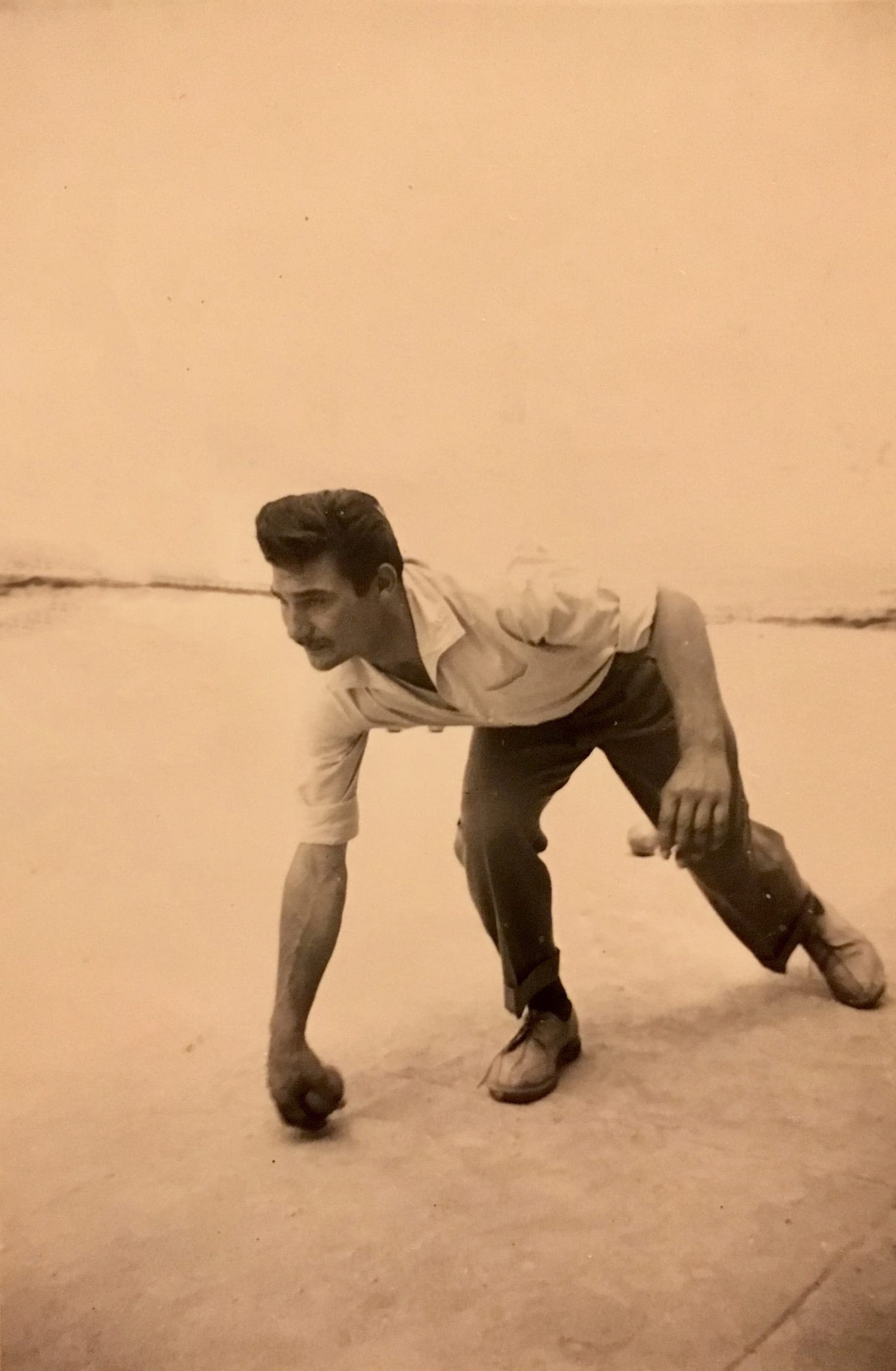
My grandad, pictured here, playing ‘pétanque’. Si il tire ou il pointe, ça reste un mystère.
A free and open source variable font with French attitude and British mannerisms across 3 axis: weight, width & optical size
Bricolage Grotesque is a blend of historical sources, technical decisions and personal feelings. It started as a fork of Mayenne Sans, an open-source single weight font designed by Jérémy Landes. It evolved by reinforcing cues from French sources, namely Antique Olive, and British sources, more obviously from the Grotesque series by Stephenson Blake. Using modern aesthetics and technology, it aims to traverse an emotional landscape that stretches back to my grandfather crossing the ‘Méditerranée’ and ends with my own experience as a Frenchman living in England for over a decade.
Bricolage is French for improvising something you need by combining or repurposing readily available materials and Bricolage Grotesque is so steeped in historical sources and references that it’s hard to call it anything else. It’s a re-interpretation of existing ideas but for a different purpose: trying to visually express what it feels like to move countries and rebuild, what it feels like to have a hybrid identity where you cannot be what you were and yet you can never truly be anybody else.
Bricolage Grotesque is designed by me, Mathieu Triay (1989 —). This typeface is dedicated to my grandfather, Edgard Triay (1928 — 2010).
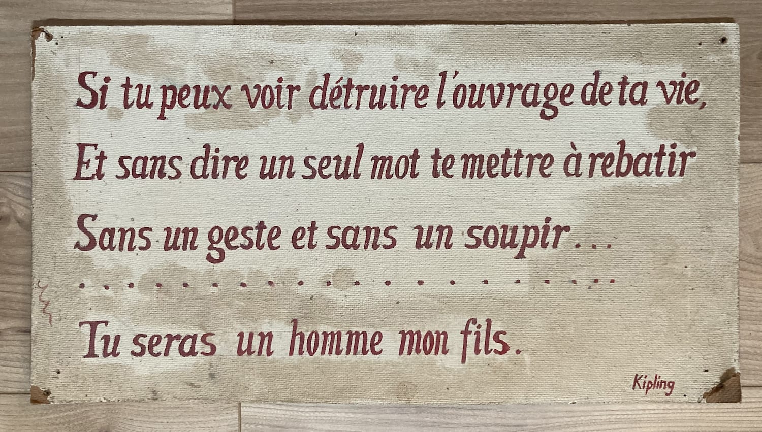
Translating poetry is bricolage too so here’s the matching extract in the original English
Or watch the things you gave your life to, broken,
And stoop and build ’em up with worn-out tools
Rudyard Kipling, 1895
In his ‘atelier’, my grandad had a few lines of If— by Rudyard Kipling lettered on a piece of hardboard:
Si tu peux voir détruit l’ouvrage de ta vie
Et sans dire un seul mot te mettre à rebâtir
Translation by André Maurois, 1918
The stoicism of the poem is really a reflection of his attitude — not a man of many words. Similar ideas were foundational in my education, even though I never had to face the hardships described in the poem as a child. In fact, the idea of ‘rebuilding’ was quite alien, I had barely ‘built’ anything to begin with. However, my grandfather had a whole life and family with him when war forced him to move to France. Coming from a traditional background, and having witnessed the horrors of the war, he was a time capsule transplanted into a world that changed under his feet.

The only thing I had really built at the time were terrariums. I traipsed around the local stream to catch frogs and snakes. Some of them much like this one, a marsh frog or grenouille rieuse.
When my turn came to rebuild, it was not so obvious. I wasn’t even aware that’s what I was doing. If anything, it was exciting because I was oblivious. It took over a decade for me to realise the implications of what I had done. Leaving everything behind to go and settle in another country. Like boiling a frog, it happened step by step in a way that was invisible to me. First, move for education, then stay for work and then for love.
A non exhaustive list of things that make me unhappy: Brexit, the downfall of the economy and the underfunding of the NHS and — this whole nation should be on strike by French standards.
Still, it still felt like there was a wound that needed healing, something I hadn’t tended to and that patiently waited for my attention. Sometimes, life moved so fast, I didn’t even have the time to miss my family. It became obvious during the pandemic: who am I?
Since I’d moved to England, each trip back to my native South of France had been a progressively curious experience between frustration and familiarity. The many British mannerisms I’d picked up changed my expectations and some things that used to feel natural now felt ‘wrong’. Similarly, coming back to England only highlighted what I missed most and the things that rubbed against the grain of my personality.
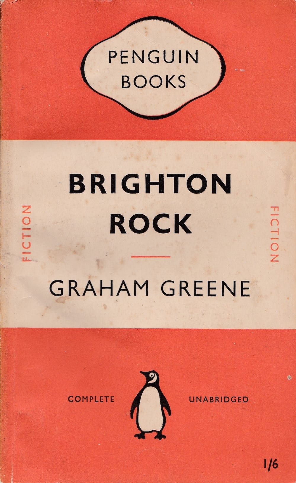
The early Penguin book covers have an undeniable charm, orderly but approachable.
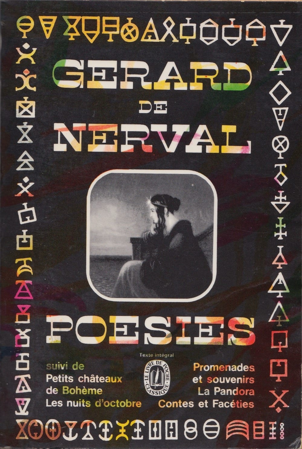
A sliver of Faucheux’s talent, trading readability for arresting layouts and visual excitement.
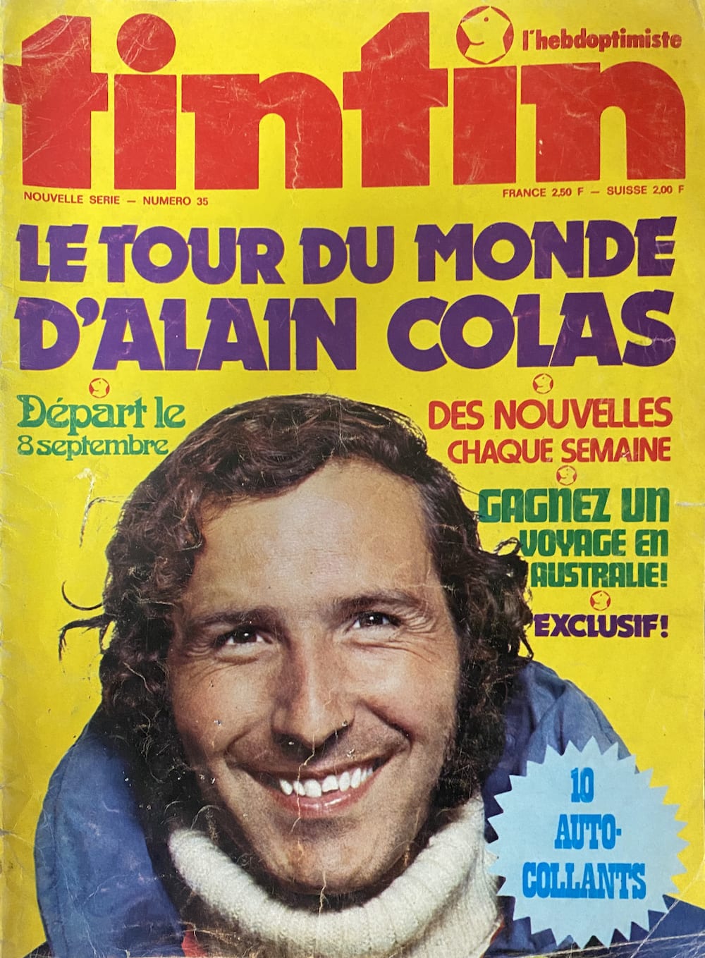
Tintin, a French magazine from Dad’s collection (1973). What an assortment of faces! Dynamo, Arnold Böcklin, Ronda, Futura Display, Playbill.
Though my design education has largely happened in England, the unconscious bedrock upon which it’s built is French. Working with English designers, I’ve learnt to appreciate a certain kind of restrained quirkiness — ‘dignified but flippant’ — but I couldn’t take it wholesale. I’m constantly reminded of how attached I am to my visual roots. When I go back to my parents’ and peruse the bookshelves, I see the old covers designed by Faucheux and the old magazines full of phototype.
I can see how they shaped what I consider ‘good’ or ‘interesting’ graphically. Now, surrounded by walls of Stephenson Blake Grotesques, Gill Sans and Johnston, it’s hard not to take a liking to the considered authority they carry. But as soon as I see a little bit of Antique Olive, Choc or Banco on a shopfront, I stand in admiration to their expressiveness.
There are many typefaces claiming to be neutral, but my quest is always about expression. A typeface that will provide the foundation of a feeling, and — like a good bassline — lead you into the groove without taking over. To the crystal goblet I say ‘let’s see some coloured glass’.
I found the perfect starting point to synthesise these thoughts into an expanded design by accident. A few months into lockdown, I heard Jérémy Landes talk about forking open source fonts and stumbled on his Mayenne Sans. It had a French demeanour, with visible influence from Antique Olive hiding inside a more contemporary Grotesque design.
I forked the font and worked to make it fully display-oriented (I knew I wanted a separate design for smaller optical sizes, as I did for Marvin Visions). I tightened the spacing and tried to lean into the Antique Olive influence by taming the parts of the design I judged to be too wild (for instance, the tiny counter in the bowl of the ‘a’).
Jeremy’s treatment of the ‘c’ and ‘e’ with the uneven bite reminded me of similar details in the Grotesque series by Stephenson Blake and I tried to steer in that direction, leading to the development of more condensed style in the spirit of Grotesque №9, really emphasising the inward curves.
Because the ends of the width axis were influenced by different sources, I could now navigate from a more French regular width to a more British compressed and yet keep a contemporary feel thanks to the exaggerated ink traps from Mayenne Sans.
Tackling the light weights, the traps made the stems appear spindly, particularly in the condensed styles. This is more of a recent issue because ink traps are now used stylistically rather than purely functionally. So here the stems flare up to restore the impression of weight.
Ink Traps
When it came to the smaller sizes, I started again from Mayenne Sans and injected more of Antique Olive’s texture rather than its shapes (I love the colour and rhythm of the original specimens). I adjusted the proportions to try to achieve a similar feel, particularly in the lighter weights. Overall, I toned down the style in favour of something more neutral to make it more readable while keeping the liveliness. For instance, the stems taper less visibly than in Mayenne Sans and the terminals are more traditional while opening up the counters as much as possible.
12pt text at the 12pt optical size
12pt text at the 96pt optical size
12pt text at the 12pt optical size
Type designers try to get their fonts to look good at all sizes, so they design dedicated versions with particular adjustments. This includes changing proportions and spacing, as well as modifying the size of the lowercase in relation to capitals. This practice is not new and was necessary in the past when punchcutters manually adjusted characters for each size. However, with technological advancements and economical constraints, manufacturers made compromises by creating different sizes from a single design. The results were functional but lacked the refinement of the hand-adjusted metal designs. Today, designers aim to strike a balance between ideal aesthetics and practicality. They can use multiple masters and interpolate reasonable results without having to draw each individual size.
12pt text at the 96pt optical size
Type designers try to get their fonts to look good at all sizes, so they design dedicated versions with particular adjustments. This includes changing proportions and spacing, as well as modifying the size of the lowercase in relation to capitals. This practice is not new and was necessary in the past when punchcutters manually adjusted characters for each size. However, with technological advancements and economical constraints, manufacturers made compromises by creating different sizes from a single design. The results were functional but lacked the refinement of the hand-adjusted metal designs. Today, designers aim to strike a balance between ideal aesthetics and practicality. They can use multiple masters and interpolate reasonable results without having to draw each individual size.
The result is an eclectic design space. The compressed weights lean more towards the anxious and wonky tones of Grotesque №9 and the regular width has a bit more of Antique Olive’s relaxed and confident attitude. The smaller optical sizes become more neutral and reflective of contemporary sans.
Edgar Allan Poe
The Murders in the Rue Morgue
The mental features discoursed of as the analytical, are, in themselves, but little susceptible of analysis. We appreciate them only in their effects. We know of them, among other things, that they are always to their possessor, when inordinately possessed, a source of the liveliest enjoyment. As the strong man exults in his physical ability, delighting in such exercises as call his muscles into action, so glories the analyst in that moral activity which disentangles. He derives pleasure from even the most trivial occupations bringing his talent into play. He is fond of enigmas, of conundrums, of hieroglyphics; exhibiting in his solutions of each a degree of acumen which appears to the ordinary apprehension præternatural. His results, brought about by the very soul and essence of method, have, in truth, the whole air of intuition.
The optical sizes are fixed to match the font size. Use the individual the sliders to navigate the design space.
96pt masters
12pt masters
David Jonathan Ross talks about putting up posts in a circus tent as a metaphor for a design space. The idea is that if there’s too much physical distance between two posts, the tent will be floppy and loose in between. You have to be strategic with the position and number of your posts to make sure your design is properly propped up. I like that image a lot but with three axis I wanted to make sure I could draw the minimum number of masters while keeping the fabric taut.
I decided to draw 8 masters: Bold and Thin, Compressed Bold and Compressed Thin and the same again but for 12pt optical size. I noticed that because the extremities of each axis were drawing from different sources, the need for intermediate masters was greatly reduced. I guess this would be akin to the angle at which you plant the post. If the angles go in opposite direction, you’re able to create more tension in the fabric.

When Europeans first encountered a platypus, they sent a sketch back. Scientists thought it was a hoax; multiple animals stitched together. It was simply too grotesque to be real.
You can be the judge of whether this approach is successful or not. The important thing is that it’s allowed me to discover what lies at the intersection — something I couldn’t have designed at the start because I didn’t know what it would look like. By relinquishing control to the tools, to the variable font technology, I was able to obtain something that would have otherwise been impossible before: an ever changing artefact of which I only defined the corners, an artefact that you can use, in turn, to explore things of your own.
In the context of my cultural identity, parts of the design suddenly had an emotional significance. I could travel from France to England and feel the typeface become more anxious as it became more compressed. It doesn’t — the typeface is fine — but to me it illustrated a feeling I didn’t even know I had experienced. This platypus of a typeface was able to articulate something about belonging that I couldn’t describe.
Some text samples in different languages
Tous les êtres humains naissent libres et égaux en dignité et en droits. Ils sont doués de raison et de conscience et doivent agir les uns envers les autres dans un esprit de fraternité.
Tất cả mọi người sinh ra đều được tự do và bình đẳng về nhân phẩm và quyền. Mọi con người đều được tạo hoá ban cho lý trí và lương tâm và cần phải đối xử với nhau trong tình bằng hữu.
Bütün insanlar hür, haysiyet ve haklar bakımından eşit doğarlar. Akıl ve vicdana sahiptirler ve birbirlerine karşı kardeşlik zihniyeti ile hareket etmelidirler.
The many people who have seen this typeface in development like it. They like it for different reasons than I do. Maybe you will too. It supports all the languages that I know and many more that I don’t, including Vietnamese. It doesn’t have any italics (sorry). You can be safe in the knowledge that after three years in the making, I’ve given it my best shot.
So, here lies Bricolage Grotesque, a historical and cultural Frankenstein’s monster created from the DNA of Mayenne Sans and body parts pillaged from Antique Olive and Stephenson Blake Grotesques. Neither French nor British, neither historic nor modern. It’s free and open source and it formally invites you to a bricolage session on the day of your choosing. Break it apart and build it again.
I beheld the wretch—the miserable monster whom I had created
Mary Shelley Frankenstein; or, The Modern Prometheus
Colophon
Bricolage Grotesque is designed, spaced and kerned by Mathieu Triay (with the help of Kern-On). Additional quality assurance by Emma Marichal. Nhung Nguyen provided very helpful advice on the design of the Vietnamese diacritics.
Website design, code, and writing by Mathieu Triay with additional design support from Matthew Young.
Penguin book cover photographed by Jeremy Crawshaw. Frog and platypus illustrations are public domain as are the book extracts used as samples. Every other image from Mathieu’s personal collection.
The website also uses a few personal forks of Bricolage Grotesque to demonstrate its relationship to Mayenne Sans, Antique Olive and Grotesque №9.
Acknowledgements
None of this would have been possible without the tireless support and feedback of Alana Laing, Tom Etherington, Francisca Monteiro and of course Matthew Young.
I would also like to thank David Jonathan Ross and Alice Savoie for making themselves available in moments of doubt. Their counsel was precious throughout.
Many thanks to Jérémy Landes for making Mayenne Sans and to Google for providing the funding for me to finish this project. In particular, thanks to Dave Crossland for his unwavering patience.
Lastly, thanks to my family for their help and support from the very beginning.
About
Mathieu Triay is a French designer and software engineer based in London. He runs Atelier Triay, a small creative practice producing websites and fonts amongst other physical and digital artefacts. In 2017 he released Marvin Visions, a variable font specially created for Visions, a science-fiction publication he designed and edited.
Atelier Triay, © 2023